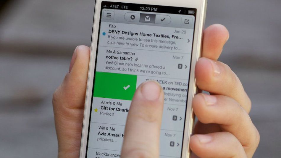
Review: Mailbox app for the iPhone
This past weekend I got the green light to start using the new Mailbox app from Orchestra. Email innovation is exciting to think about, but did they deliver a game changing solution?
For many, email is the first thing we check when we roll out of bed every morning and the last thing we check before we call it a night. It is no surprise that we are always hungry for an easier, more organized email solution but does mobile email have room for innovation? After all, Apple the king of touch technology by many measures already provides a touch-friendly mail app, and there are a small handful of others in the app store. Orchestra sure thinks so, they have poured a lot of time and money into this new endeavor. The company’s new app, Mailbox, rethinks mobile email and presents your mail in more of a checklist type manor. Right now you can only use it with Gmail, but down the road hopefully they will open it up to more email providers. Lets jump in and take a closer look.
The teaser video
The Quest for Inbox Zero
Everyone has their own process for how they try to stay on top of their email, but in the end we all have a common goal, to keep up with the never ending stream of new messages. If we think back just 10-15 years ago, most people were just getting used to email and most emailing was done sitting at a desktop. Fast forward back to today and contrast that with how connected we are now: iPhones, tablets, netbooks, laptops, desktops, 3G, 4G, LTE...... Needless to say we are now hardwired in to a digital world, no wonder why it is difficult to keep up. Gentry Underwood, CEO of Orchestra, the company behind Mailbox, in regard to mobile email usage says:
"The big a-ha was discovering that the primary-use case of email on the phone was really triage," he explains. "It’s taking those couple of minutes that you have to go through your mail and trying to look at what’s new that you need to worry about--and what you don’t need to worry about."
Gentry Underwood · CEO, Orchestra
This is the primary problem that Mailbox is trying to solve. How? Quickly archive emails you’ve finished reading, hit snooze and set reminders for emails you want to put off for later, and build email lists based on any criteria you choose.
The Design & User Experience

The Mailbox interface is clean and simple, there is no doubt the flat design is upon us. The app takes a very minimal approach to sorting out your email, it breaks incoming emails into three basic categories: those you want to keep in your inbox, those you would like to save for later, and those you would like to get rid of lickity split.
The experience is heavily gesture driven, basically swiping left or right over an email will trigger an action. Do you want to archive an email? A short swipe to the right will do that, gone from view. Want to delete? Try a longer swipe right. For me this will take some getting used to, I found myself not able to quickly get the proper action to trigger when swiping. I'm interested to see if others struggle with the short and long swipes.
Limitations
So one of the really cool things that the app provides is support for push notifications. The problem is how much server power it takes for them to provide such a feature.
From the Mailbox site: Mailbox relies on servers in the cloud to do things like send push notifications, make downloading email as fast as possible, and handle snoozed messages. Software that is server-based is susceptible to being overloaded and we want to keep this from happening. This is email, after all, and it needs to work reliably.
Even with the scalable pricing behind cloud resources today, Orchestra still has to be careful and that is why they are throttling the ramp up with a waiting list. Lets dive into that.
A Reservation System?
So this is a hot topic surrounding the launch out of the app. Don't take my word for it, check the App Store and the low rating speaks for itself. I do think a small factor in this release was to build hype and demand, however it does stand to reason that you wouldn't want to unleash this to everyone at once and completely overload the servers. Either way there was going to be waiting, but I think they chose the right road and i'd wager to say they will ramp up more horsepower over the next couple days to get the signups done in a reasonable amount of time.

Conclusion
Mailbox is pretty darn cool at the end of the day. That being said, I don't think this new philosophy of inbox management is for everyone, but things like "snooze" will be appealing for most. It is simple and fairly straight forward to use, though I do need to get used to some of the gestures. The search functionality is on par with gmail so that is pretty convenient, but as a user of tags in Gmail I wish they played a bigger role in app. For other Gmail power users out there, like me i'm sure you will miss having a spam button readily available to report junk mail. Another big thing for me is that it only supports Gmail, I have several email accounts so I still have to use the mail app on my iPhone, is having to flip between both really worth it? I'll wait a few more weeks before I decide that.
If they continue to refine and inprove the experience, and pair it with a killer desktop version, they are going to make some serious waves. What will the premium paid version offer? Tough to say, but as of now I wouldn't pay for the current version. I'll definitely be keeping an eye on Orchestra for the next few months to see to see what they come up with next.
What do you think?
Do you have any questions or comments (positive or negative!) about this article? Don't be shy, I'd love to hear from you, ping me on Twitter.
Tweet @Simpson